NgBootstrap: Setup
Examples on setting up Bootstrap and NgBootstrap in an Angular application
To use NgBootstrap in a module...
in module's module.ts file
import { NgbModule } from '@ng-bootstrap/ng-bootstrap';
and include NgbModule in the module's imports
package.json

{
  "name": "app-name",
  "version": "1.0.0",
  "scripts": {
    "ng": "ng",
    "start": "ng serve",
    "start:mock": "ng serve --configuration=mock",
    "start:dev": "ng serve --configuration=dev",
    "build": "ng build",
    "preprod": "ts-node version-builder.ts",
    "prod": "ng build --prod",
    "test": "ng test",
    "lint": "ng lint",
    "e2e": "ng e2e",
    "compodoc": "npx compodoc -p src/tsconfig.app.json -s",
    "gen:client": "java -jar ../code-gen/swagger-codegen-cli-2.3.1.jar generate -i ../server/api/swagger/swagger.yaml -l typescript-angular -o src/app/api -t ../server/api/swagger/templates --additional-properties ngVersion=7.0.0 && rxjs-5-to-6-migrate -p src/tsconfig.app.json && replace-in-file --configFile=replace-config-file-upload.json",
    "gen:spritesheet": "svg-sprite --css --css-render-css --dest=src/styles --css-dest=spritesheet  --css-bust=false --css-sprite=spritesheet src/assets/*.svg"
  },
  "private": true,
  "dependencies": {
    "@angular/animations": "^7.0.2",
    "@angular/common": "^7.0.2",
    "@angular/compiler": "^7.0.2",
    "@angular/core": "^7.0.2",
    "@angular/forms": "^7.0.2",
    "@angular/http": "^7.0.2",
    "@angular/platform-browser": "^7.0.2",
    "@angular/platform-browser-dynamic": "^7.0.2",
    "@angular/router": "^7.0.2",
    "@fortawesome/fontawesome-free": "^5.11.2",
    "@ng-bootstrap/ng-bootstrap": "^4.2.1",
    "@ng-bootstrap/schematics": "^2.0.0-alpha.1",
    "bootstrap": "^4.0.0",
    "core-js": "^2.5.4",
    "crossfilter2": "1.4.0",
    "lodash": "^4.17.11",
    "moment": "2.22.1",
    "ng2-nouislider": "^1.8.2",
    "nouislider": "^14.0.1",
    "popper.js": "^1.14.5",
    "rxjs": "^6.3.3",
    "rxjs-compat": "^6.5.2",
    "zone.js": "^0.8.26"
  },
  "devDependencies": {
    "@angular-devkit/build-angular": "~0.10.4",
    "@angular/cli": "~7.0.4",
    "@angular/compiler-cli": "^7.0.2",
    "@angular/language-service": "^7.0.2",
    "@compodoc/compodoc": "^1.1.9",
    "@types/jasmine": "~2.8.6",
    "@types/jasminewd2": "~2.0.3",
    "@types/node": "~8.9.4",
    "codelyzer": "~4.5.0",
    "jasmine-core": "~2.99.1",
    "jasmine-spec-reporter": "~4.2.1",
    "karma": "~1.7.1",
    "karma-chrome-launcher": "~2.2.0",
    "karma-coverage-istanbul-reporter": "~1.4.2",
    "karma-jasmine": "~1.1.1",
    "karma-jasmine-html-reporter": "^0.2.2",
    "protractor": "~5.3.0",
    "replace-in-file": "4.1.3",
    "svg-sprite": "^1.5.0",
    "ts-node": "~5.0.1",
    "tslint": "~5.9.1",
    "typescript": "~3.1.6"
  }
}
src/styles
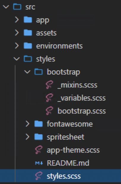
styles.scss
/* You can add global styles to this file, and also import other style files */
@import "./bootstrap/bootstrap";
@import "./app-theme.scss";

bootstrap/_mixins.scss
@import "~bootstrap/scss/mixins";

bootstrap/_variables.scss
// Your variable overrides
// Copy variables from `variables` to this file to override default values
// without modifying source files.


@import "~bootstrap/scss/functions";


// App custom color variables.
$brand-blue:          #4AA2B9;
$brand-blue-100:      #ECF6F9;
$brand-blue-300:      #E0F4FA;
$brand-blue-800:      #00214D;
$brand-dark-blue:     #00005A;
$brand-red:           #B31B1B;
$brand-gray:          #F2F2F2;
$brand-gray-border:   #DDDDDD;
$brand-gray-controls: #F8F8F8;
$brand-gray-controls-border: #ced4da;
$brand-gray-100:      #DDDDDD;
$brand-gray-400:      #BBBBBB;
$brand-gray-500:      #707070;
$brand-gray-600:      #444444;
$brand-gray-800:      #262626;
$brand-green:         #2CA722;
$brand-yellow:        #EBAE0B;
$brand-orange:        #D3663D;
$brand-teal:          #21778C;
$brand-teal-100:      #4AA2B9;
$brand-white:         #FEFFFE;
$brand-black:         #000000;


// Color overrides.
$body-bg: $brand-screen-background;
$blue:      $brand-blue;
//$indigo:  #6610f2 !default;
//$purple:  #6f42c1 !default;
//$pink:    #e83e8c !default;
$red:       $brand-red;
$orange:    $brand-orange; // #fd7e14 !default;
$yellow:    $brand-yellow; // #ffc107 !default;
$green:     $brand-green;
$teal:      $brand-teal; // #20c997 !default;
//$cyan:


// Font overrides
// Fonts
//
// Font, line-height, and color for body text, headings, and more.
@import url('https://fonts.googleapis.com/css?family=Poppins');
// stylelint-disable value-keyword-case
$font-family-sans-serif:      'Poppins';
// stylelint-enable value-keyword-case


$font-size-base:              0.8125rem; //`13px` at 16px default pixel size
$font-size-sm:                ($font-size-base * .875) !default;
/*$font-size-lg:                ($font-size-base * 1.25) !default;


$font-weight-light:           300 !default;
$font-weight-normal:          400 !default;
$font-weight-bold:            700 !default;


$font-weight-base:            $font-weight-normal !default;
$line-height-base:            1.5 !default;


$h1-font-size:                $font-size-base * 2.5 !default;
$h2-font-size:                $font-size-base * 2 !default;
$h3-font-size:                $font-size-base * 1.75 !default;
$h4-font-size:                $font-size-base * 1.5 !default;
$h5-font-size:                $font-size-base * 1.25 !default;
$h6-font-size:                $font-size-base !default;


$headings-margin-bottom:      ($spacer / 2) !default;
$headings-font-family:        inherit !default;
$headings-font-weight:        500 !default;
$headings-line-height:        1.2 !default;
$headings-color:              inherit !default;


$display1-size:               6rem !default;
$display2-size:               5.5rem !default;
$display3-size:               4.5rem !default;
$display4-size:               3.5rem !default;


$display1-weight:             300 !default;
$display2-weight:             300 !default;
$display3-weight:             300 !default;
$display4-weight:             300 !default;
$display-line-height:         $headings-line-height !default;


$lead-font-size:              ($font-size-base * 1.25) !default;
$lead-font-weight:            300 !default;


$small-font-size:             80% !default;


$text-muted:                  $gray-600 !default;


$blockquote-small-color:      $gray-600 !default;
$blockquote-font-size:        ($font-size-base * 1.25) !default;


$hr-border-color:             rgba($black, .1) !default;
$hr-border-width:             $border-width !default;


$mark-padding:                .2em !default;


$dt-font-weight:              $font-weight-bold !default;


$kbd-box-shadow:              inset 0 -.1rem 0 rgba($black, .25) !default;
$nested-kbd-font-weight:      $font-weight-bold !default;


$list-inline-padding:         .5rem !default;


$mark-bg:                     #fcf8e3 !default;


$hr-margin-y:                 $spacer !default;*/


$input-btn-focus-width:       .2rem !default;
$input-btn-focus-color:       rgba(0, 166, 210, 0.4) !default;
$input-btn-focus-box-shadow:  0 0 0 $input-btn-focus-width $input-btn-focus-color !default;


@import "~bootstrap/scss/variables";


/* Merge the custom brand colors to the Bootstrap theme. Bootstrap auto generates the .border-{theme color name}, .text-{theme color name}, and .bg-{theme color name} selectors for us.
    For example, you can now define .text-brand-blue, .bg-brand-green, .alert-brand-red,  or .border-brand-gray class selector in your HTML*/
    $theme-colors: map-merge((
        "brand-blue":           $brand-blue,
        "brand-blue-100":       $brand-blue-100,
        "brand-blue-300":       $brand-blue-300,
        "brand-blue-800":       $brand-blue-800,
        "brand-dark-blue":      $brand-dark-blue,
        "brand-red":            $brand-red,
        "brand-gray":           $brand-gray,
        "brand-gray-border":    $brand-gray-border,
        "brand-gray-controls":  $brand-gray-controls,
        "brand-gray-controls-border": $brand-gray-controls-border,
        "brand-gray-100":       $brand-gray-100,
        "brand-gray-400":       $brand-gray-400,
        "brand-gray-500":       $brand-gray-500,
        "brand-gray-600":       $brand-gray-600,
        "brand-gray-800":       $brand-gray-800,
        "brand-green":          $brand-green,
        "brand-yellow":         $brand-yellow,
        "brand-orange":         $brand-orange,
        "brand-teal":           $brand-teal,
        "brand-teal-100":       $brand-teal-100,
        "brand-white":          $brand-white,
        "brand-disabled-blue":  $brand-disabled-blue,
        "brand-black":          $brand-black
      ), $theme-colors);
Referencing _variables.scss from other component scss
@import '../../../styles/bootstrap/variables';
bootstrap/bootstrap.scss
/**
* Use this file to override any styles from
* bootstrap that you would like. Suggest creating
* separate files for each overriding component
* to match the bootstrap structure.
*/


@import "~bootstrap/scss/functions";
@import "variables";
@import "mixins";
@import "~bootstrap/scss/root";
@import "~bootstrap/scss/reboot";
@import "~bootstrap/scss/type";
@import "~bootstrap/scss/images";
@import "~bootstrap/scss/code";
@import "~bootstrap/scss/grid";
@import "~bootstrap/scss/tables";
@import "~bootstrap/scss/forms";
@import "~bootstrap/scss/buttons";
@import "~bootstrap/scss/transitions";
@import "~bootstrap/scss/dropdown";
@import "~bootstrap/scss/button-group";
@import "~bootstrap/scss/input-group";
@import "~bootstrap/scss/custom-forms";
@import "~bootstrap/scss/nav";
@import "~bootstrap/scss/navbar";
@import "~bootstrap/scss/card";
@import "~bootstrap/scss/breadcrumb";
@import "~bootstrap/scss/pagination";
@import "~bootstrap/scss/badge";
@import "~bootstrap/scss/jumbotron";
@import "~bootstrap/scss/alert";
@import "~bootstrap/scss/progress";
@import "~bootstrap/scss/media";
@import "~bootstrap/scss/list-group";
@import "~bootstrap/scss/close";
@import "~bootstrap/scss/modal";
@import "~bootstrap/scss/tooltip";
@import "~bootstrap/scss/popover";
@import "~bootstrap/scss/carousel";
@import "~bootstrap/scss/utilities";
@import "~bootstrap/scss/print";